Categories
Business News

The Location of Every Job in Cincinnati Mapped

Ohio Employment Dot Map

Two years ago, University of Virginia researcher Dustin Cable put together a detailed dot map based on the racial distribution of people in the United States. This work inspired another researcher to put together something similar, but for America’s job distribution.

Robert Manduca studies sociology and social policy at Harvard University. He says that while jobs and the economy are continuously discussed, we seem to know very little about where jobs are actually located. So what he did was examine the Census Bureau’s Longitudinal Employer-Household Dynamics data and then plot that information out on an interactive map.

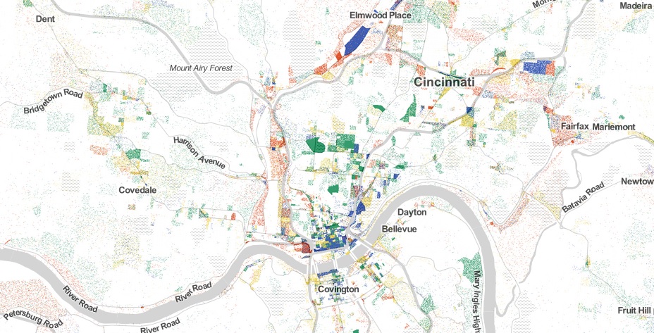
The LEHD data is based on state unemployment insurance records, and tabulates the count of jobs by census block,” Manduca explained on his website. “Here, jobs are colored by type, allowing us to see how different industries and sectors exhibit different spatial patterns–some clustering in downtowns, others spreading across city and suburbs alike.”

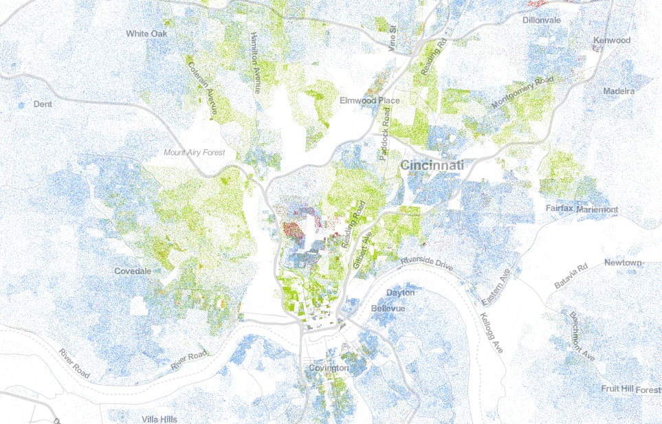
The way the visualization works is that red represents Manufacturing & Trade; blue for Professional Services; green for Healthcare, Education and Government; and yellow for Retail, Hospitality and Other Services.

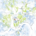
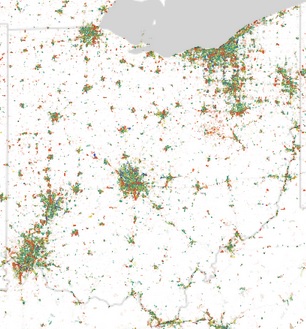
Upon examination of the map, you can see that some cities and regions have a much stronger concentration of jobs than others. When looking at Ohio from a distance, it looks like this pattern holds true for the state’s three big cities. That picture changes as a more detailed look is taken at Manduca’s research.

In Cincinnati, for example, the two largest job centers, downtown and uptown, are joined by the Mill Creek Valley and Blue Ash as areas with heavy concentrations of jobs. As expected, there is a large cluster of education and health jobs uptown, while downtown boasts the region’s heaviest concentration of professional service jobs.

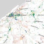
Blue Ash then comes in as, perhaps, the most impressive job center for professional service jobs in the region outside of the center city.

The Mill Creek Valley, which generally runs north along I-75 from the Ohio River, serves as the region’s primary manufacturing and trade corridor. This industrial corridor is well-rooted in Cincinnati’s history, and is even reflected in the City of Cincinnati’s robust tax collections from these zip codes.

The research reveals how much of a barrier the natural landscape serves as when considering job distribution. Throughout the Cincinnati region, for example, you can see how the hills cut across the landscape.

The data also shows that while Cincinnati is often defined by an east/west divide, the distribution of jobs is far more north/south oriented than it is east/west. Of course, the same is true for the region’s population.

Categories
Up To Speed

Not building protected bike lanes is a transport policy failure

Not building protected bike lanes is a transport policy failure.

Most cities take a timid approach to building new protected bike lanes. Instead of building out a comprehensive and well-connected network, they go after segments of streets where the introduction of the bike lane will not take a lane of moving traffic or parking away from those driving cars. As it turns out, new research shows that this is a bad approach. More from Streetsblog USA:

Here’s one reason the modern biking boom is great for everyone: more bicycle trips mean fewer car trips, which can mean less congestion for people in cars and buses. But there’s a catch. A recent study shows that when bicycle use rises but cities don’t add bike lanes to put the new bikers in, traffic congestion actually gets worse. In some situations, it gets a lot worse.

If a city doesn’t build bike lanes, then “bikes vs. cars” is actually real. But if a city builds bike lanes, more biking becomes a win-win. Public support for bike infrastructure and programming depends on one crucial concept: that more biking benefits people whether or not they ever ride a bike themselves. Lewis, the Atlanta transportation deputy director, said that’s one big reason it’s important to add bike lanes to busy streets when possible.

Categories
Business News Politics

UVA Demographer’s Map Illustrates Cincinnati’s Racial Segregation

Dustin Cable, a demographic researcher at the University of Virginia’s Weldon Cooper Center for Public Service, recently published a map of the United States that shows an individual dot for each of the nation’s 308,745,538 people.

On their map each dot was assigned one of five colors based on the racial and ethnic affiliation. Whites are blue; African-Americans, green; Asians, red; Hispanics, orange; and all other racial categories are coded as brown. Cable used publicly available 2010 data from the U.S. Census Bureau.

When viewed in its entirety from afar, the map makes cities look like integrated places with a merging of all the colors to create a purple shade. This, however, is not the most accurate portrait of the racial segregation found throughout American cities.

When viewing Cincinnati at a more detailed level, for example, one can see the clear separation of White, Black, Hispanic and Asian populations.

The dots are evenly distributed throughout their assigned Census Block, so some dots (or people) appear to be living in areas where they cannot (i.e. parks, water, streets).

The specific areas of interest inside Cincinnati city limits are several Uptown neighborhoods where a dense cluster of Asian individuals live, and the Lower Price Hill and East Price Hill area where a small concentration of Hispanic individuals call home.

When looking elsewhere around the region it is also interesting to observe the Hispanic population cluster in Butler County near in and around the City of Hamilton.